What Puckator's Autumn Fair Stand Got Right
I spent Tuesday at the Autumn Fair and, as always, came away with plenty of thoughts about what exhibitors are doing well, how the exhibition environment is changing and what appears to be catching buyers' attention.
One stand I particularly wanted to see was Puckator's. I have been working closely with the team over recent months and had already seen some of the thinking behind the next stage of the Puckator brand, so Autumn Fair was the first real opportunity to see part of that thinking brought to life properly.
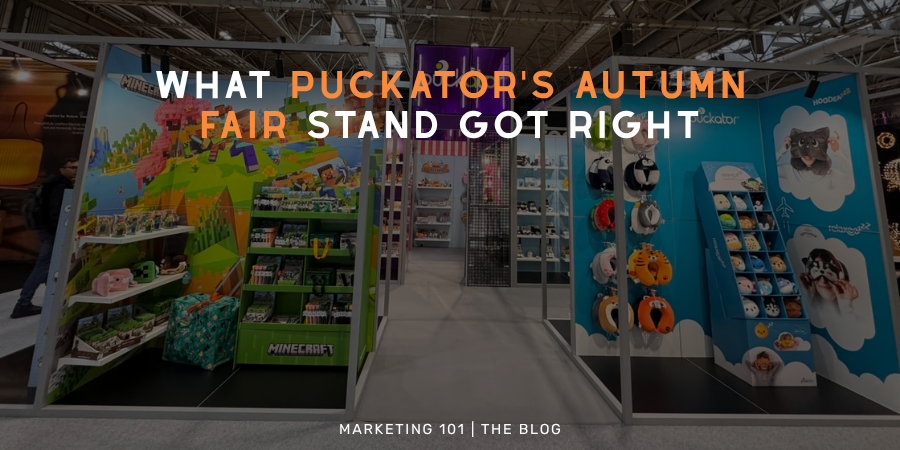
The difference was immediately noticeable. The stand was brighter, more confident and much more distinctive than previous iterations. Ted, Creative Manager, has been developing a broader colour palette built around what he calls the Puckator spectrum, using gradients and a stronger range of colours as part of the visual language. Seeing the work on a screen was one thing. Seeing it several metres wide, surrounded by hundreds of other exhibitors at the NEC, was quite another.
What interested me most was that the design has a proper reason behind it.
Puckator has an enormous product range and sells across multiple categories, countries and types of retailer. The business today is significantly broader than the company its existing visual identity was originally created to represent. The spectrum gives Ted a way of reflecting some of that breadth without simply creating a new logo, changing a few colours and calling it a rebrand.
There is also a nice connection back to the history of the business. Earlier versions of the Puckator identity had links with the sun and moon, and the new thinking develops some of that history into a much bigger visual world around the company. I think there is something valuable in that approach. Established businesses do not always need to erase everything that came before them. Sometimes the more interesting job is working out what still has meaning and finding a better way of expressing it for the business you have become.
Trade shows are a very good test of design
Autumn Fair was also a useful place to see whether the idea actually worked in practice because trade shows are fairly unforgiving environments.
Something can look fantastic in a brand presentation and disappear completely once it is sitting in a huge exhibition hall. There is product everywhere, competing graphics, lighting, signage and constant visual noise. Buyers are moving quickly and deciding all the time which stands are worth stopping at.
That means the branding has to work hard enough to give the stand presence, but not so hard that it starts fighting with the products. I thought Puckator got that balance right. The colour gave the space much more identity and made it easier to notice, but the collections were still doing the important work.
It felt like a Puckator stand that had moved forward rather than a creative concept with some products placed inside it. That sounds like a fairly small distinction, but I think it matters a great deal when you are dealing with an established wholesaler with such a broad range.
I have written quite a bit recently about trade shows needing to do more than simply showcase products, and this is another part of the same conversation. A buyer may initially stop because they like something they see on a shelf, but they are also forming a wider impression of the company they are dealing with.
Some of that comes through the practical details. Is the range easy to understand? Is the merchandising clear? Can the sales team answer the questions that matter? Does the whole experience feel organised? The environment around the product contributes to that impression as well.
I doubt many buyers walk around Autumn Fair consciously analysing a supplier's brand identity, but people absolutely notice when a company feels current, confident and as though it is progressing. That was my reaction to Puckator. The stand felt like it belonged to a business that was moving forward.
For established wholesalers, I think that is particularly important. New brands are expected to change quickly because they are still finding their feet. Businesses that have been in the market for years have a different challenge. Familiarity is valuable, but over time it can also turn into sameness if the way a company presents itself never evolves.
Products change. Retail customers change. The market certainly changes. At some point, the brand needs to keep pace as well.
Using the exhibition floor as a live test
It is important to say that what appeared at Autumn Fair was not Puckator's finished new identity. The wider brand work is still being developed and there is a much broader internal process to go through before anything is formally agreed.
I actually think that makes the Autumn Fair example more interesting.
Rather than developing an entire identity behind closed doors, signing everything off and only then discovering how it behaves in the real world, the team has been able to trial part of the thinking at scale. Ted can see how the gradients work alongside hundreds of products. The marketing team can start understanding how flexible the system is likely to be. People across the business can react to something tangible rather than trying to imagine what a brand presentation might eventually look like in practice.
There will almost certainly be things that change as the work develops further, and there should be. The value of testing something is that you learn from it.
That principle applies well beyond branding. Trade shows give wholesalers a fairly unusual opportunity to see products, commercial conversations, buyer reactions and marketing all happening in the same place. If you pay attention to what is happening rather than simply counting orders at the end, there is an enormous amount to learn.
The stand still has to do a commercial job
None of this changes my view that the stand itself cannot become the whole trade show strategy.
You can build the best-looking stand in the hall and still come away disappointed if you have not been clear about the buyers you want to meet, why you want to meet them and what should happen after those conversations. A strong exhibition presence will not fix weak trade terms, poor follow-up or a proposition that does not work commercially.
What good design can do is make the rest of the job easier. It can help somebody notice you in a busy hall and make a familiar supplier feel worth another look. It can give the buyer a stronger first impression of the business before the sales conversation has properly started.
For me, that is what Puckator got right at Autumn Fair. There were plenty of new products across the show, as you would expect, but it was equally good to see an established giftware business innovating in the way it presents itself. Not for the sake of looking different and not because every trade show needs a dramatic reinvention, but because the presentation of the company should still reflect what the company has become.
That is part of trade show readiness too.
The best exhibition stands are not necessarily the biggest or the most elaborate. They are the ones where the product, the brand and the business behind it feel as though they belong together.
We are currently speaking to giftware businesses, buyers and industry leaders about their own trade show experiences as we develop our first industry guide.
If you have exhibited, bought at trade shows or worked closely with businesses that do, I would be very interested to hear what you have learned along the way.